Siopi_Blog Post 6: 3D Models and Level Design
Hi Everyone,
My name is Indy I am the art lead for Siopi in this post I will be discussing the progress of the 3D assets in this game and some level design decisions.
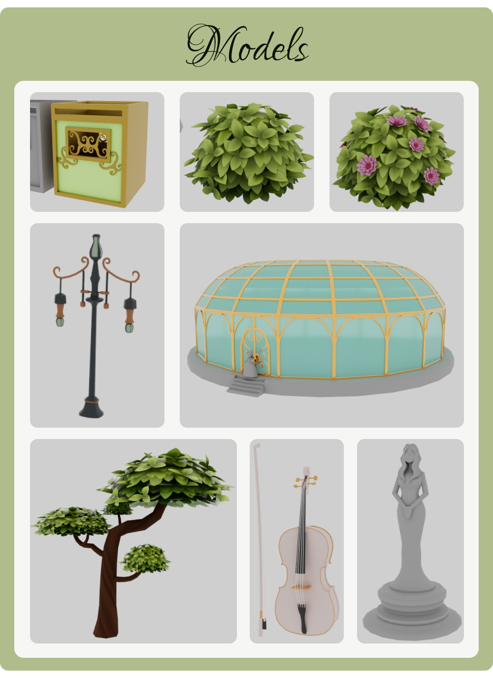
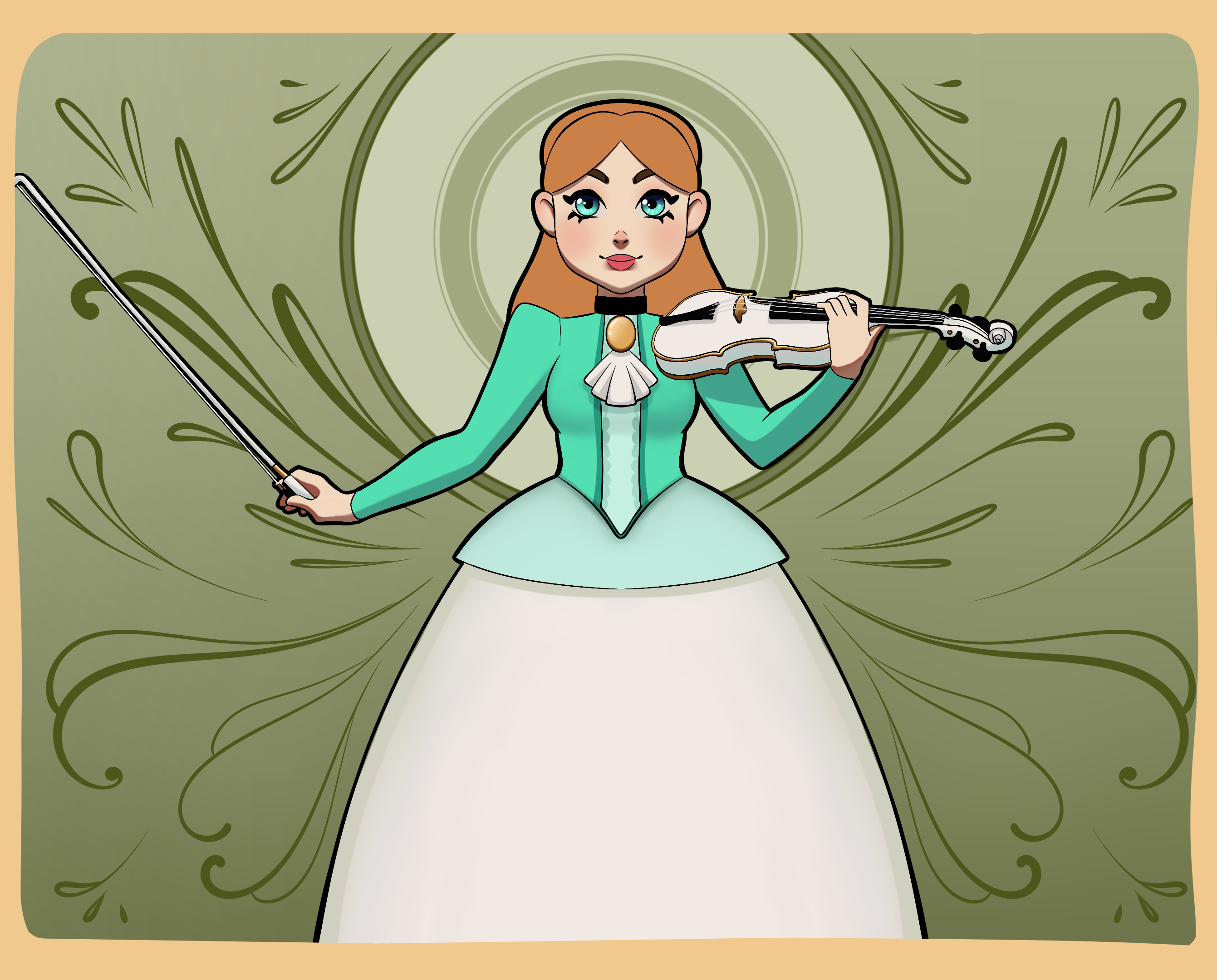
Our Game is leaning into a very cartoony and stylised look, as such we want our models to be lightly coloured and have a very happy astheteic. Our insperation for the game is partly art nouveau so even though we want a cartoony style we also want some intricate parts.

We are going for a cartoony style for the game so the models are bright and mostly solid colours. we also want a very chic and natural look for a lot of the assets. Since the game is cartoony we are going for a semi low poly style. Progress on the assets for the game is running smoothly we have most of the major assets that we need.

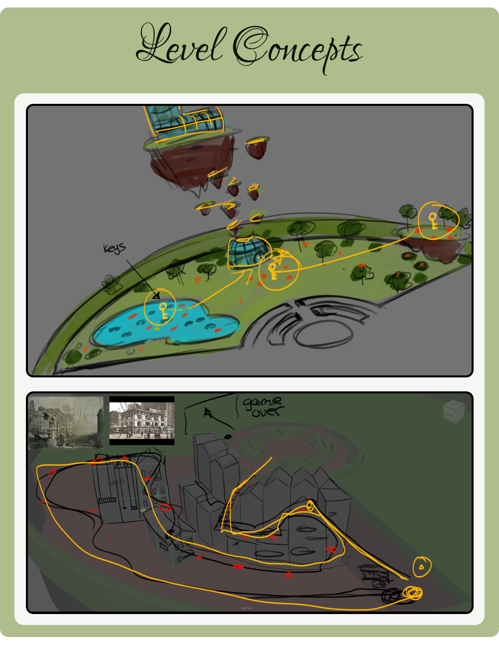
This was the concepting I had done for level one and two of the game Level one is going to be an open area where the player can go where they want an level two is going to be more linier. We desided to do this because it was a good way to have the levels be distict from one another apart from just the look of the levels. We did end up cutting the green house on top of the floating island.

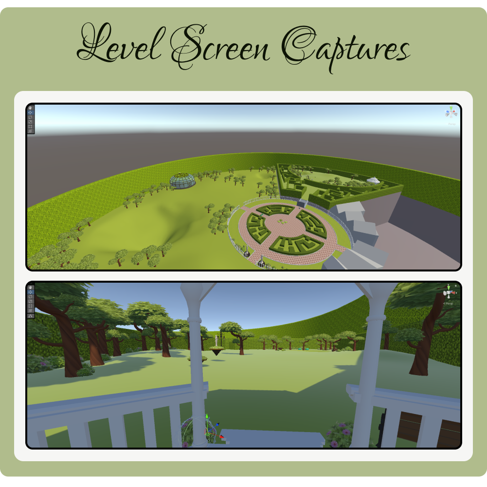
Some screen caps from the game mostly of level one as level 2 is still beaing worked on at this point.
Get Siopi
Siopi
3D Music Platformer: Siopi
| Status | Prototype |
| Author | SiopiCrew |
| Genre | Platformer |
| Tags | 3D, 3D Platformer, Music |
More posts
- Siopi Blog Post 10: Lets Break Games ReviewNov 12, 2024
- Siopi Blog Post 8: Lets Break Games & Social MediaOct 28, 2024
- Siopi_Blog Post 7: Enemy Ai ProgressOct 26, 2024
- Siopi_Blog Post 5: Marketing the Game & Asset BuildingOct 13, 2024
- Siopi_Blog Post 4: Game MechanicsOct 13, 2024
- Siopi_Blog Post 3: Concept artOct 03, 2024
- Siopi_Blog Post 2: A Change Within the TeamOct 03, 2024
- Siopi_Blog Post 1: Hello WorldAug 11, 2024

Leave a comment
Log in with itch.io to leave a comment.